
Manchester City Women Claim Their Own Identity.

DANIELLE KATEEBA
ACCOUNT EXECUTIVE
Manchester City Women just became the first WSL club to have its own distinct identity.
Fundamentally, it’s a positive move.
The team finally gets to build its own brand equity, personality
and visual language, instead
of always being read through the lens of the men's side.
But a new women’s identity raises the question: can it stand on its own, or does it need the weight of what came before it?
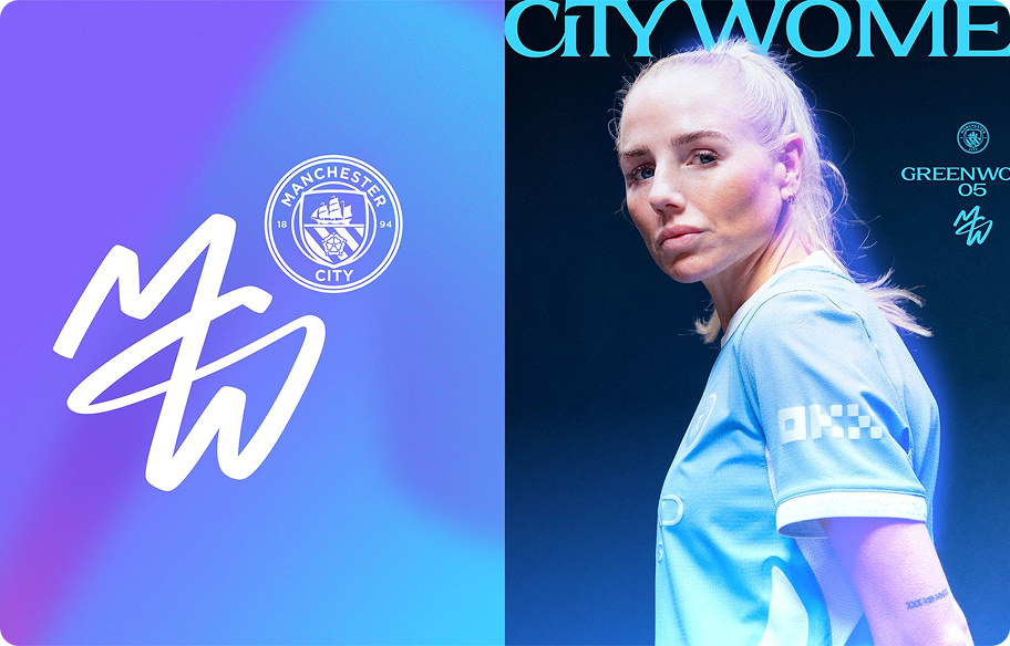
Image from: ManCity.com
“Not a women's version of Manchester City. A brand in its own right.”
It's a recognition that the women's team is a sporting and commercial property in its own right, while still sitting inside the wider City family.
This isn't about the women's team stepping away from Manchester City; it's about giving them the tools to be read as a brand on their own terms.
The balance matters: recognisably City Women, not a copy-pasted "women's version" of the men's identity. Close enough to the parent club for the connection to be obvious, distinct enough that the team isn't living in its shadow.
The identity itself feels modern, energetic and built to live beyond a logo.
The chromatic, metallic finish especially lifts it: elevated, premium, distinctive.
It's the kind of detail that photographs well, animates well, and holds
up at scale. Critically, it puts the players and the team at the centre
of the story, rather than routing every piece of communication back
through the crest.
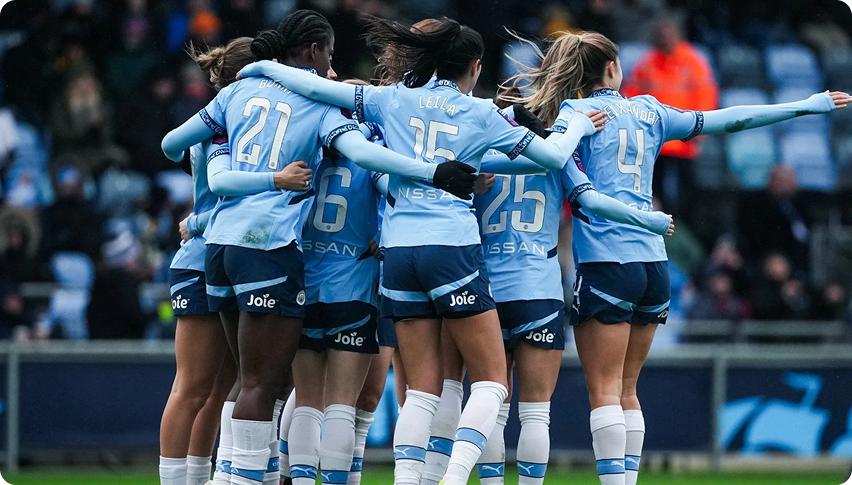
Image from: ManCity.com
Does the mark on its own carry the weight of an elite club?
In isolation, the new mark feels raw and contemporary, closer to a community club than a team competing at the top of the WSL. Sit it next to the traditional Manchester City crest, however, and that reading shifts immediately.
It may simply be that the mark hasn't yet had the time to earn the recognition the crest has built over decades. Paired together, however, the new identity reads as intentional and forward-thinking.
A new layer: It doesn't replace the master club identity, it gives the women's team ownership over a voice uniquely theirs.
The strength lies in creating space. The mark buys the team room to build a distinct tone across content, matchdays, and merchandise, speaking directly to women’s football culture without borrowing from the men’s side every time.
That matters beyond this one rebrand. As women's football keeps growing, clubs increasingly need to treat their women's teams as distinct propositions, with their own audiences and their own commercial life, rather than simply an extension of the men's game. This is what that shift looks like in practice.This isn't just a rebrand, it’s a blueprint for the future of women’s football.